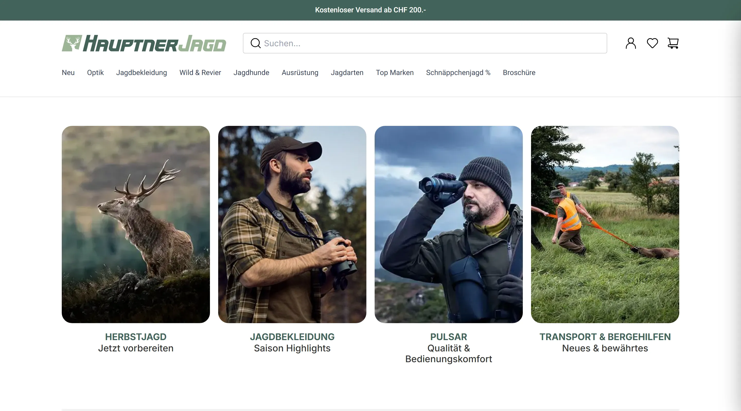
New Shopfront
For Nishcom AG, a company specializing in niche markets, the concept is already built around selling top-notch quality product lines. This is a great opportunity that already carried the legacy Shopfront for years.
However~
The market is relentlessly competitive and everchanging.
UX Designer
Modernizing and optimizing legacy platforms via new design systems, improved UX, and data-driven optimization.
Intuitive modern UX thinks of the big picture. It bridges processes in logistics, client panels, business needs and end-user needs.
This foundation goes a long way in building a product that not only keeps up with the market, it thrives and innovates.
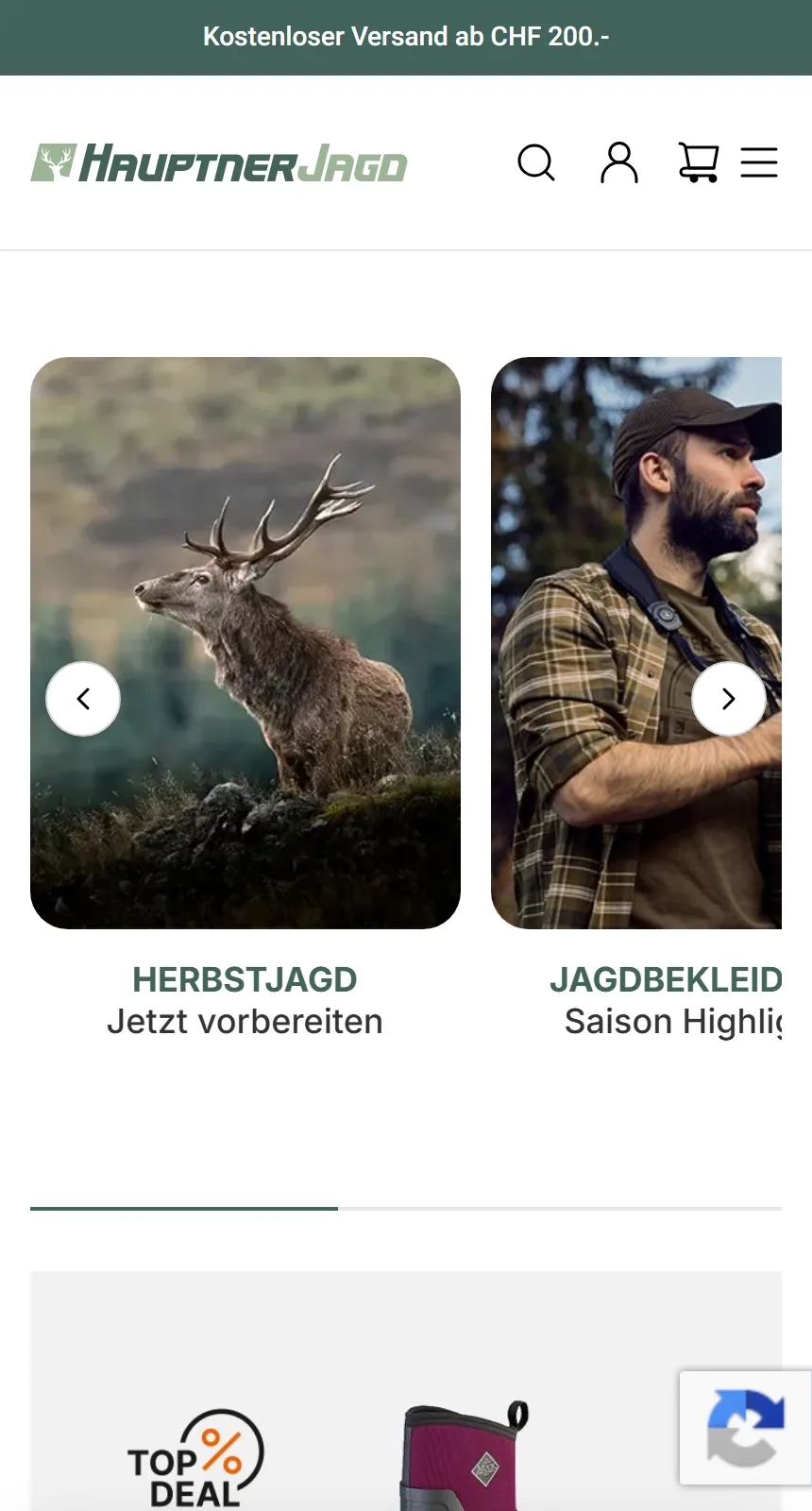
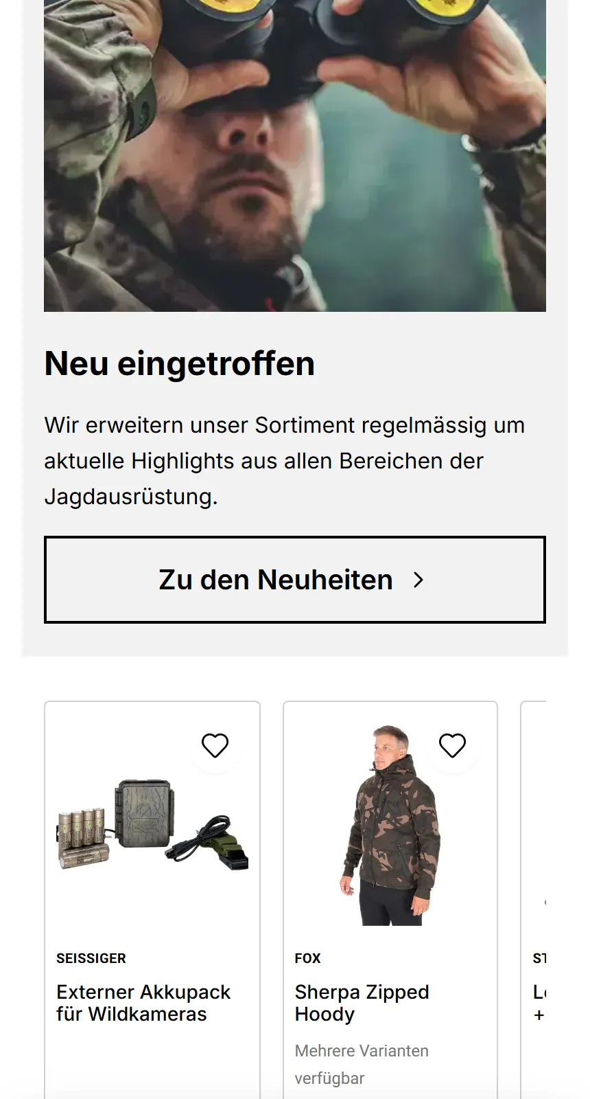
Responsive Product cards
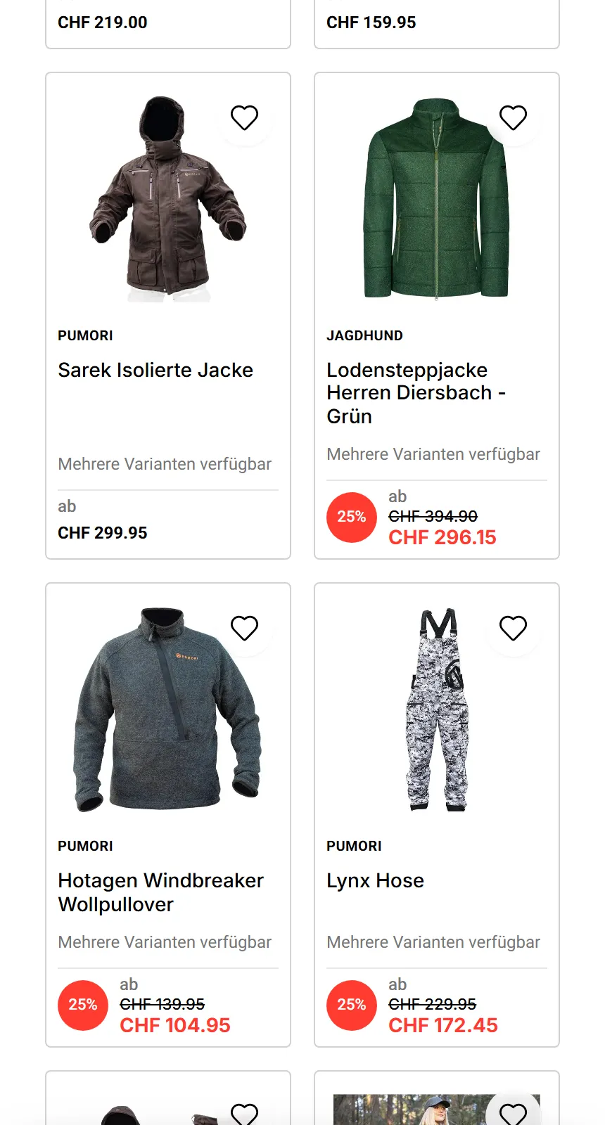
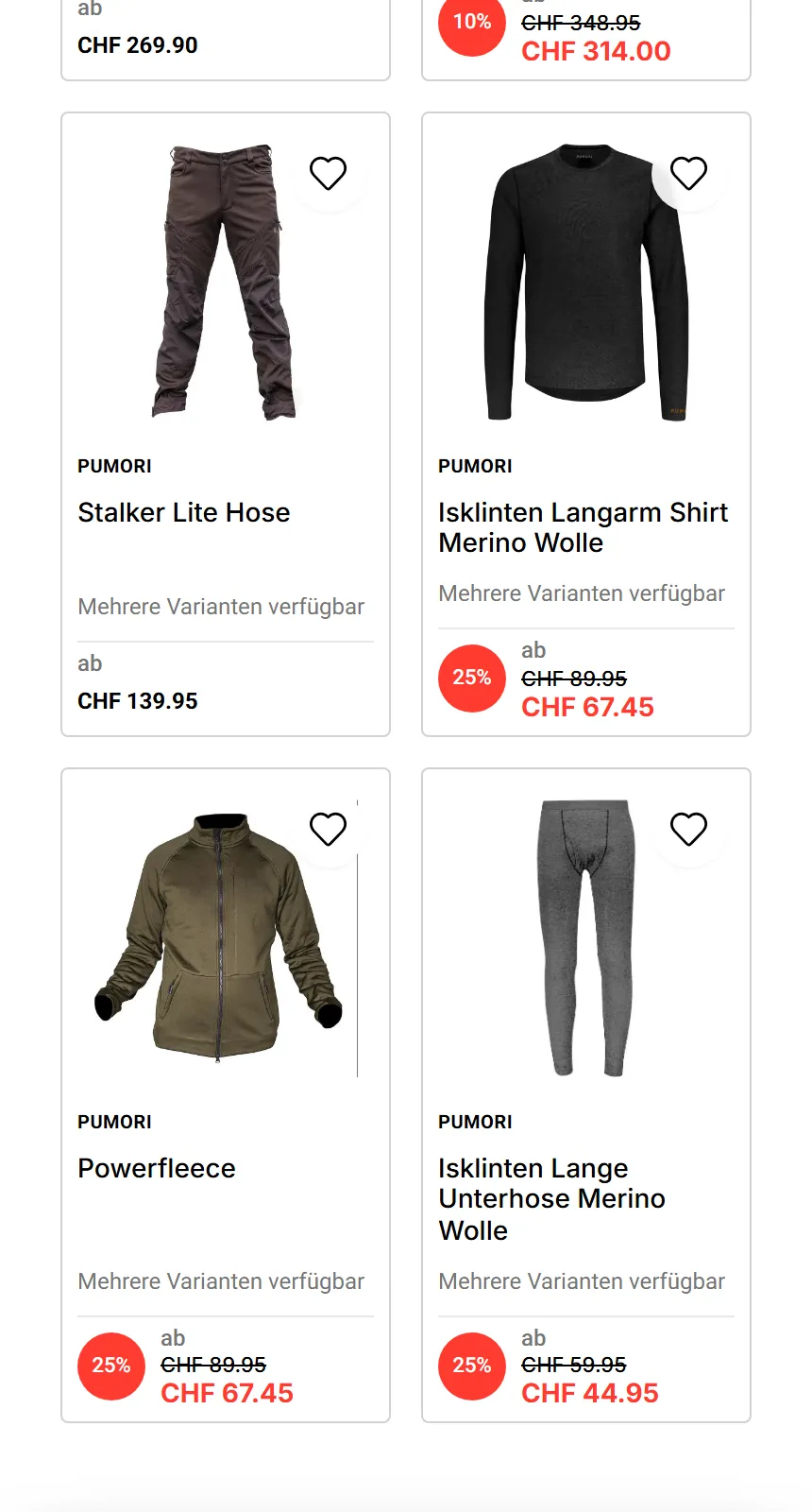
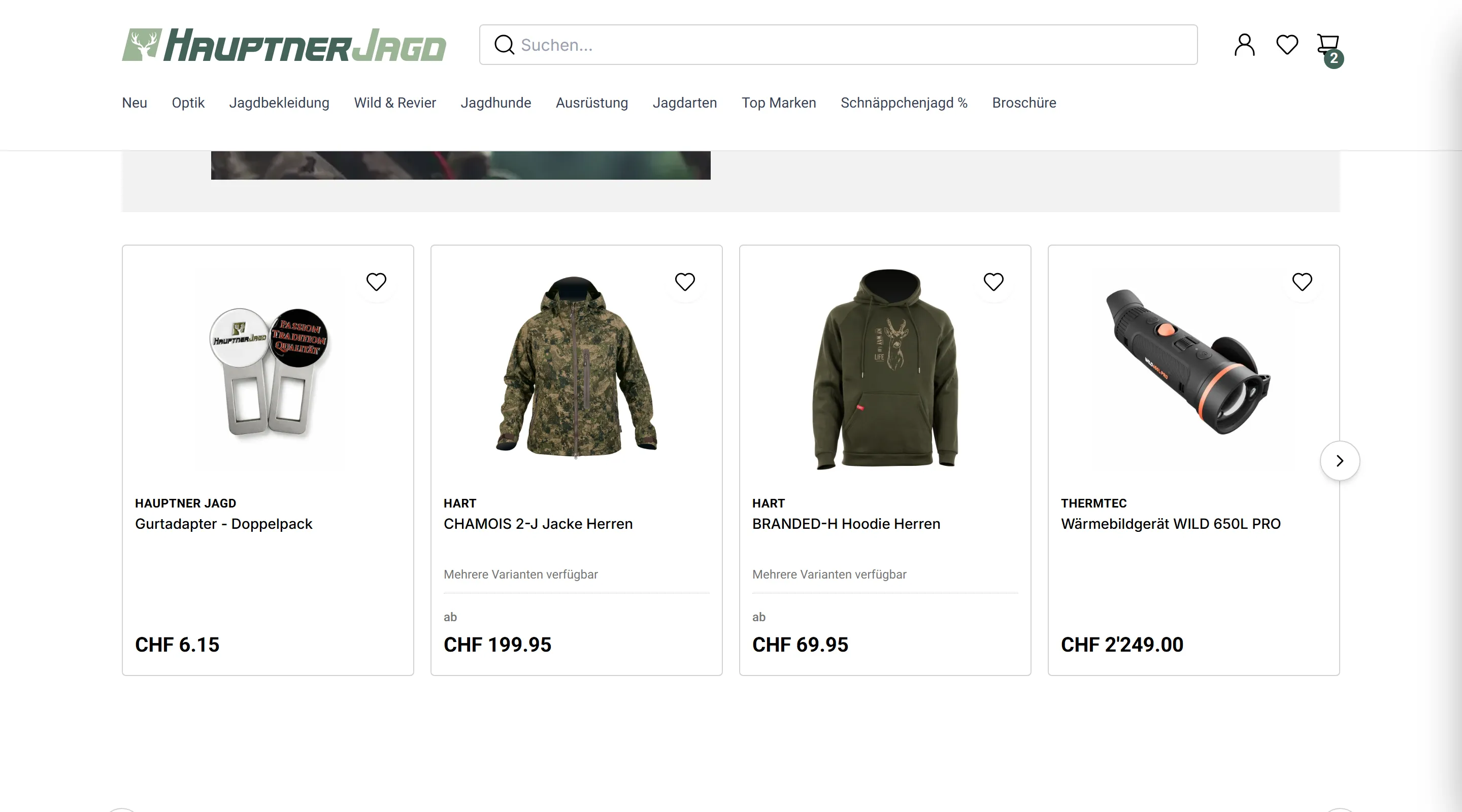
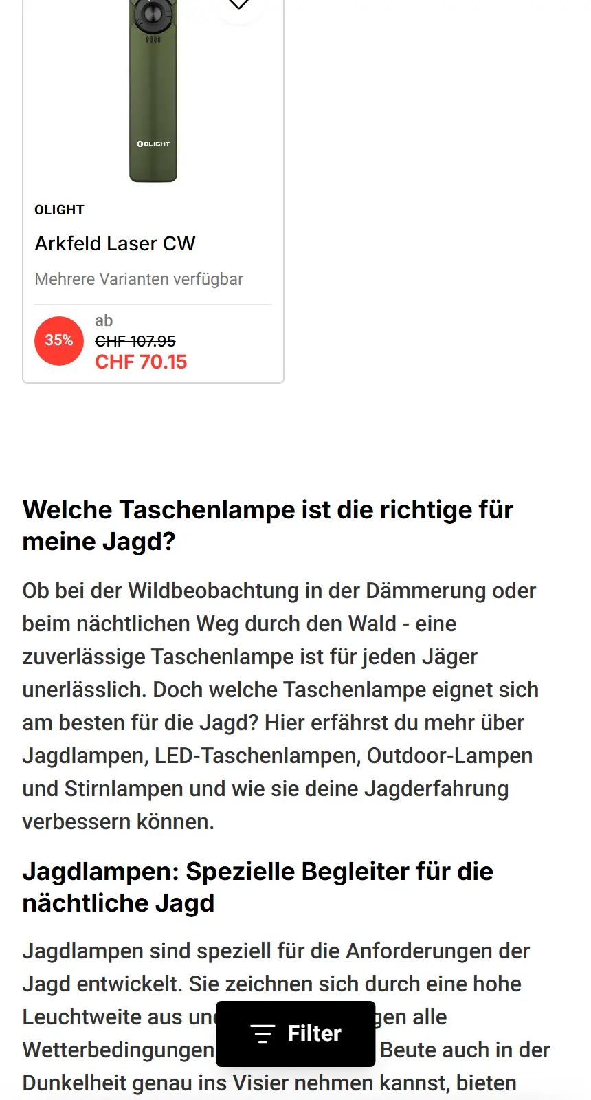
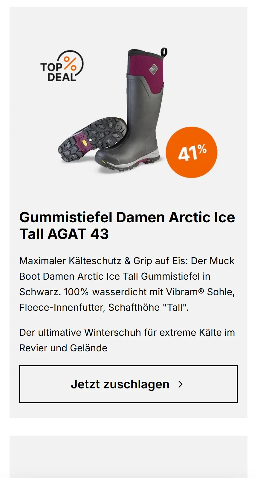
Product cards are the engine of the website. On mobile especially, having two product cards side by side per row fully visible is a game-changer for conversion rates.
Designing ones that display the right amount of relevant information for the user to move to the next step, responsive across all devices and pages of the site, was a successful, challenging, and a learning experience.
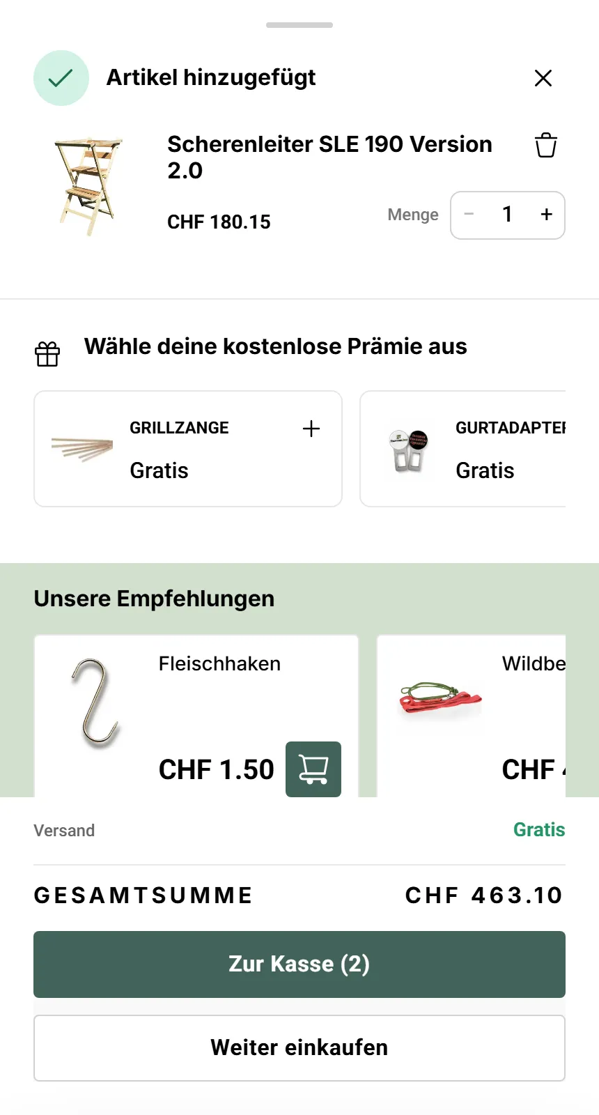
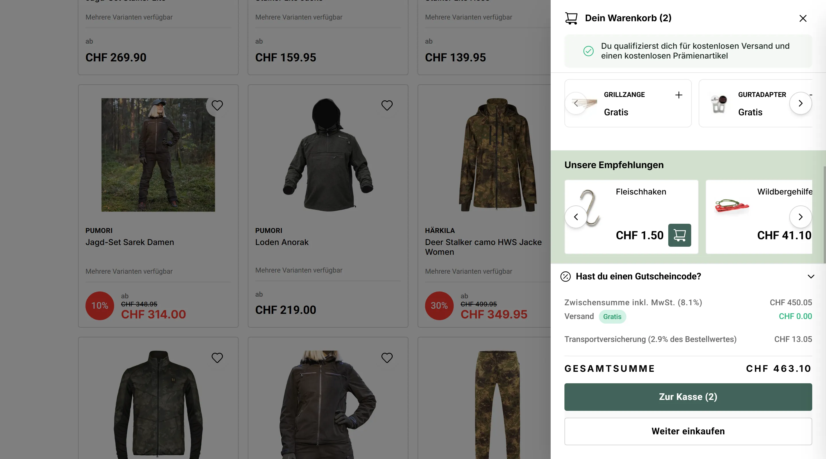
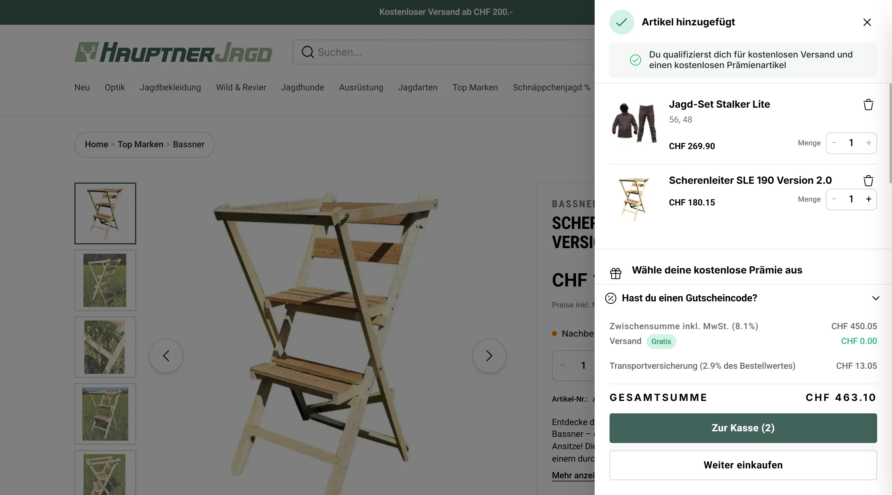
Mobile-first; Shopping cart
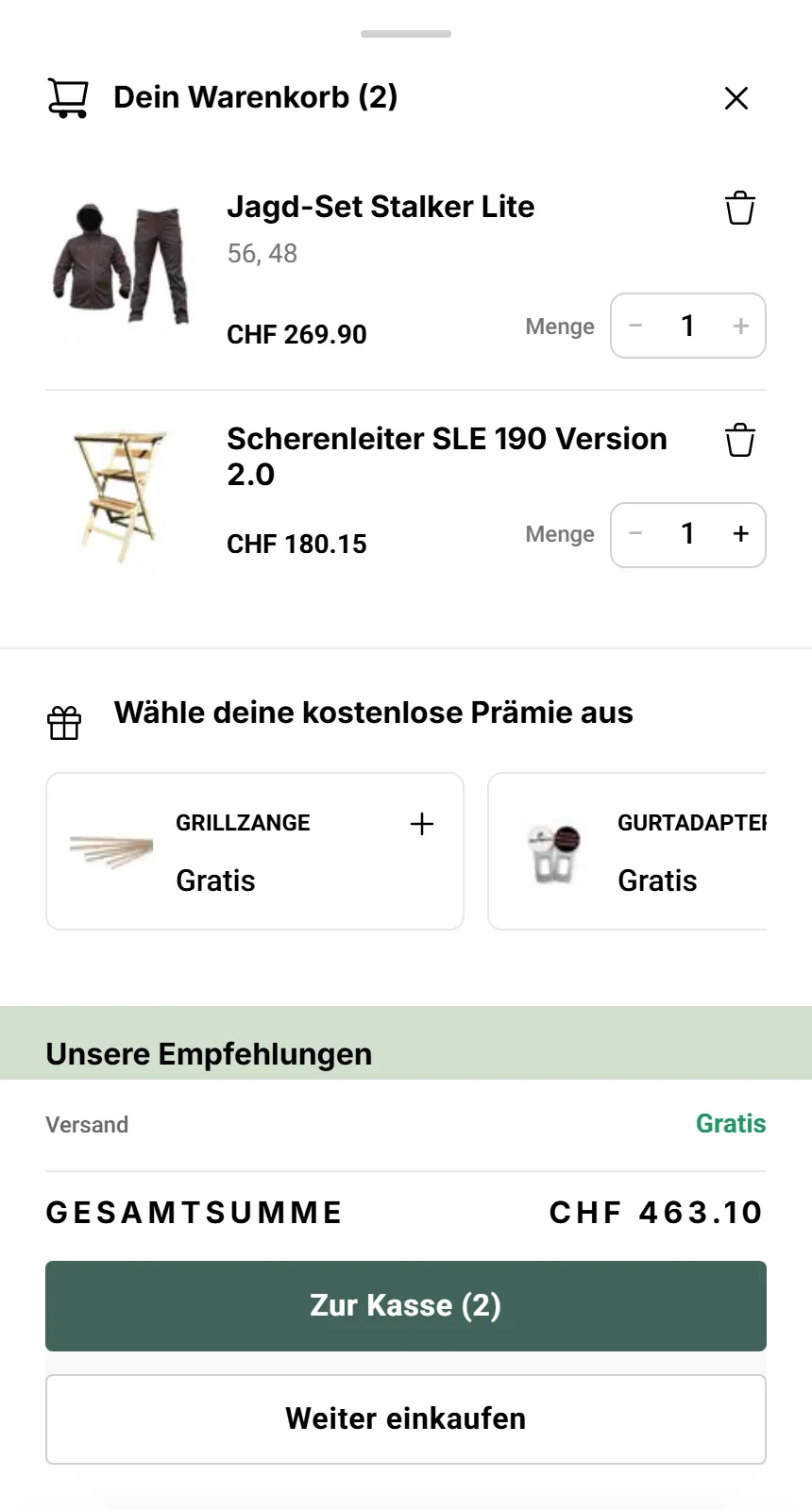
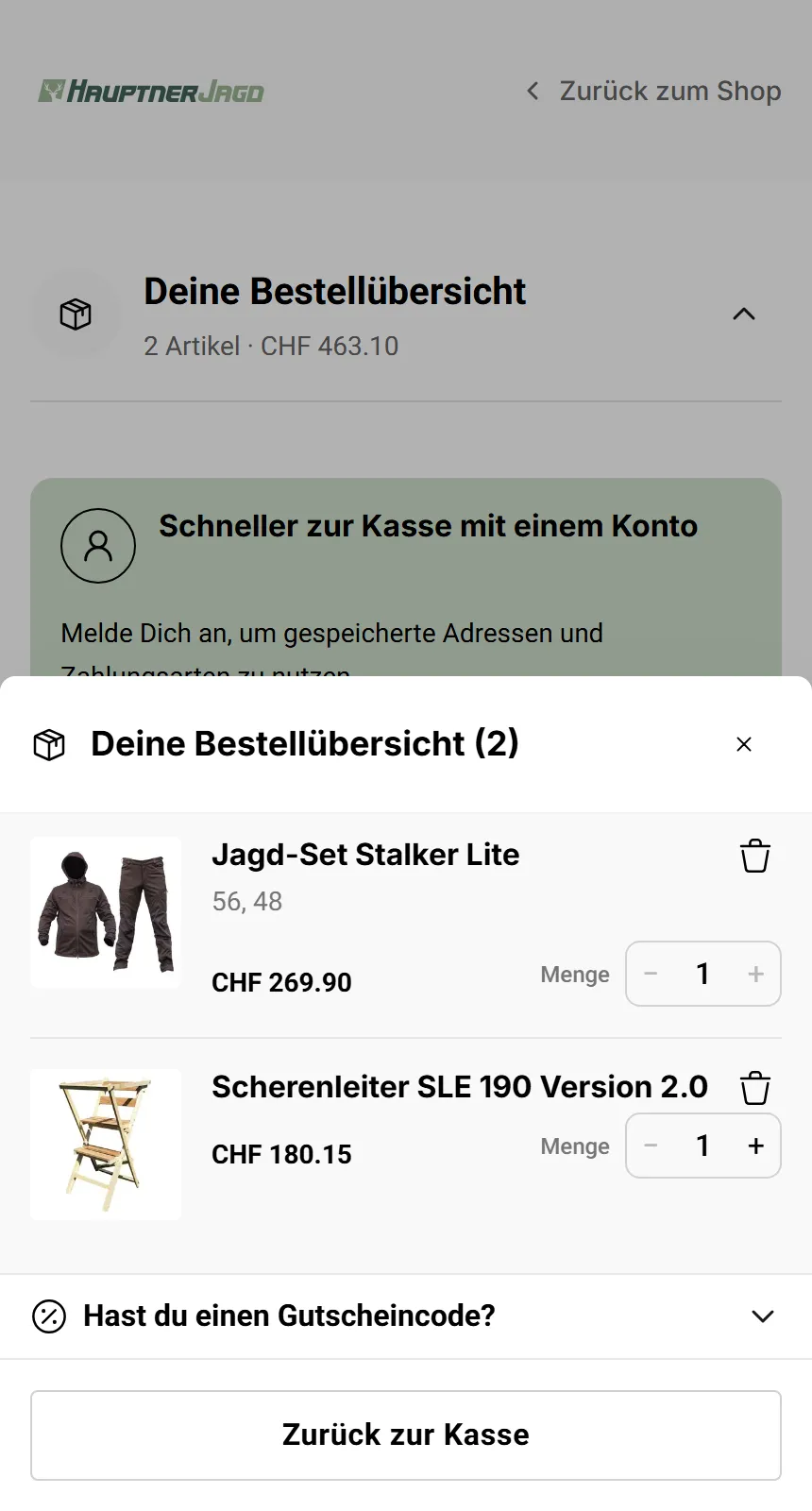
Changing the shopping cart from a full page to a sheet, bottom on mobile and side on desktop, proved to be a massive upgrade. It removed unnecessary friction from the checkout flow: without loading an entirely new page, the user can view their cart, add upsells and premium items, or adjust items without losing their anchor.
This cuts down effort and hesitation in completing a purchase, as evidenced by the 37% increase in conversions. 60% of the increase in sales were accredited to this mobile-first mindset.
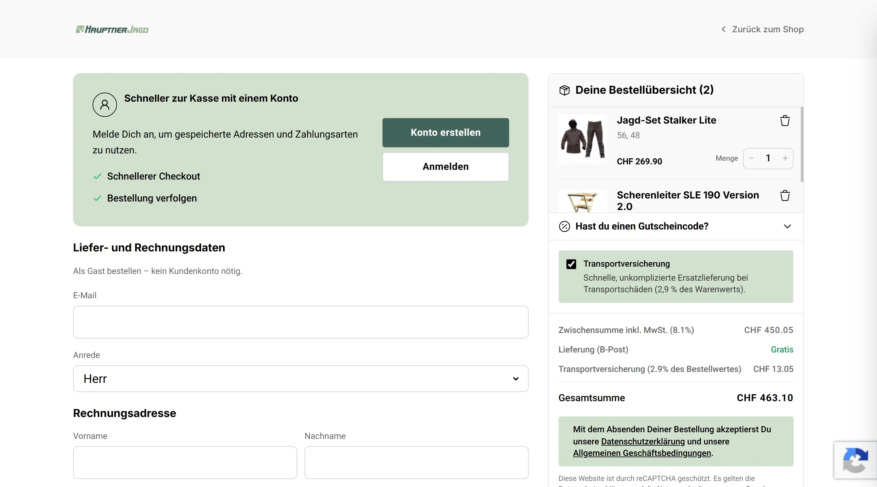
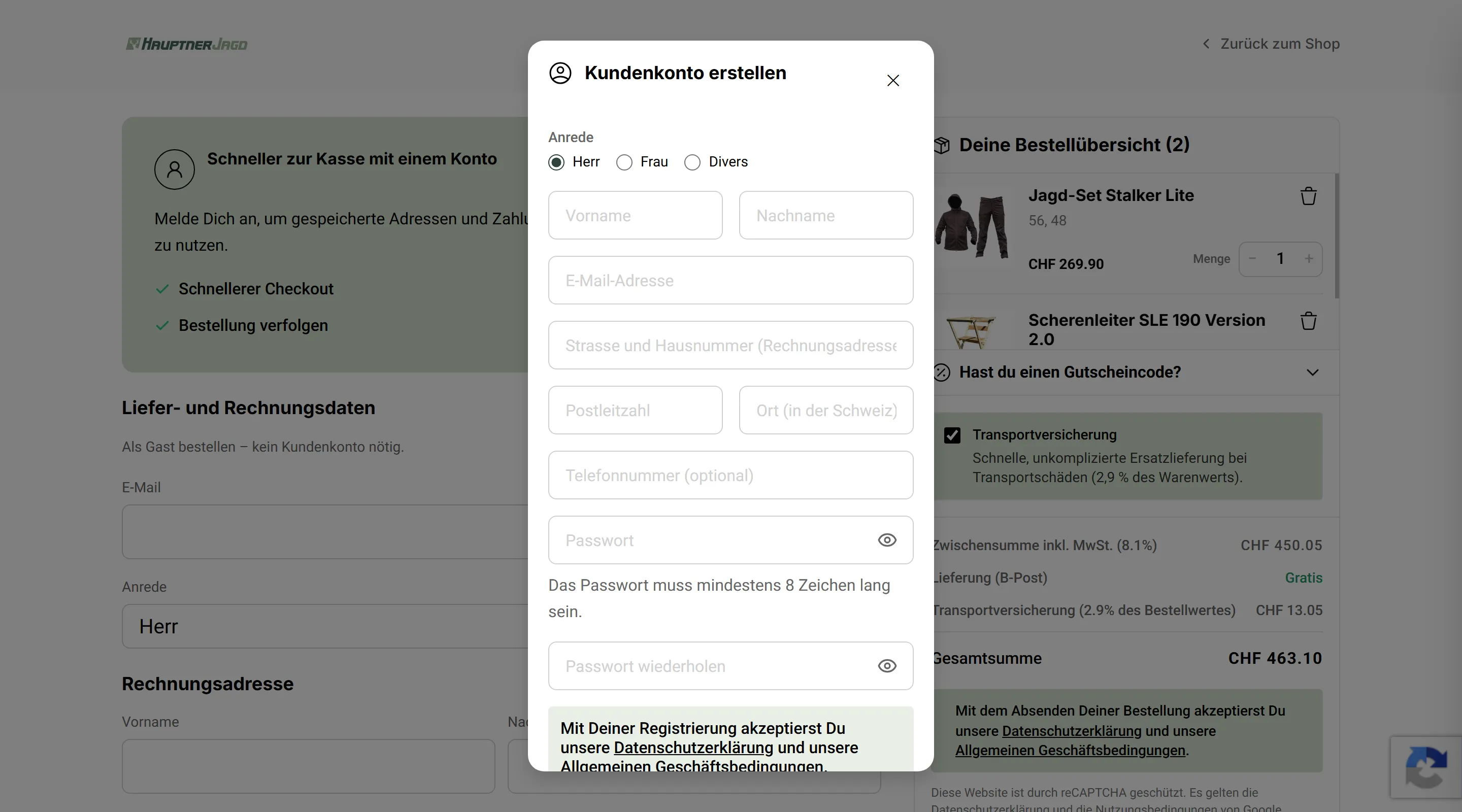
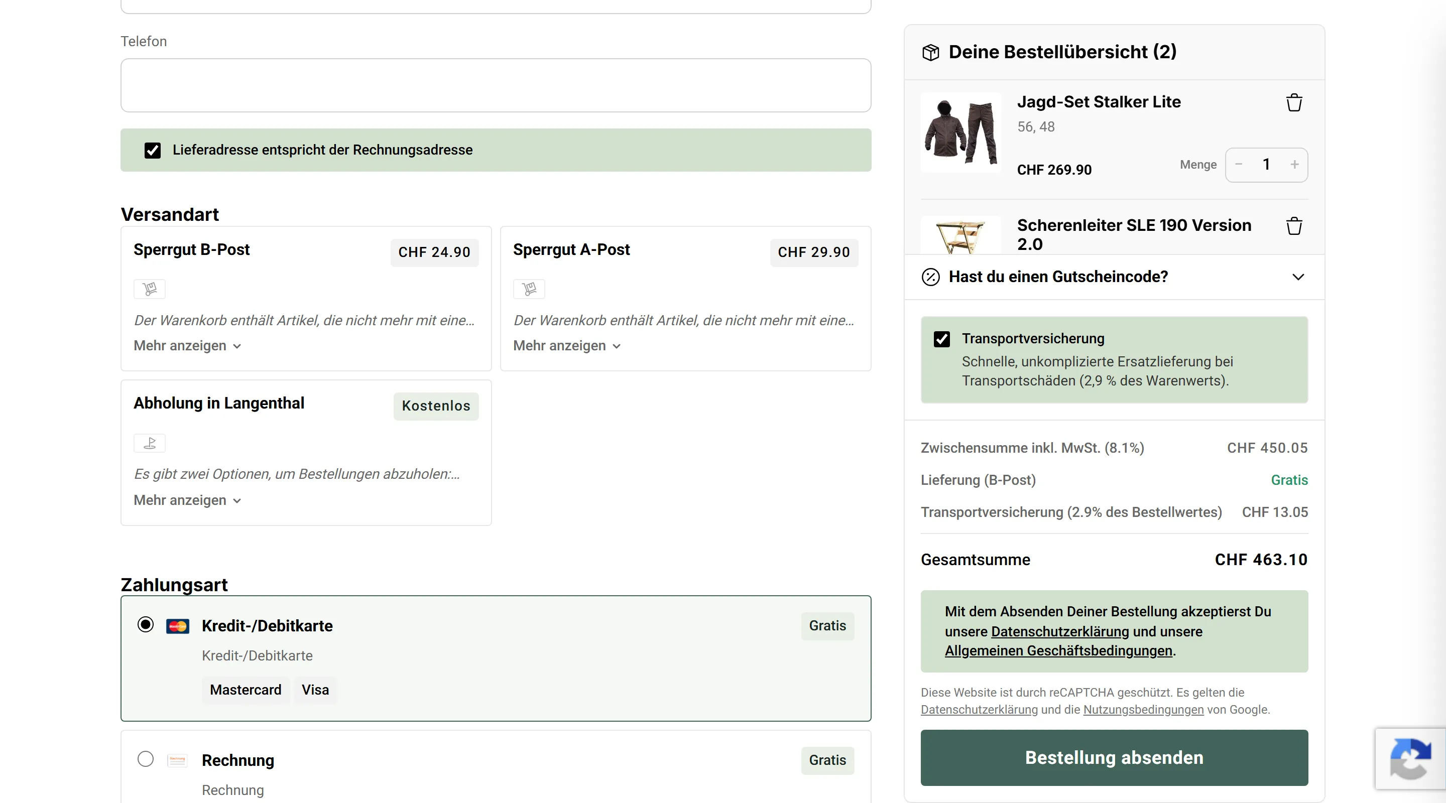
Checkout
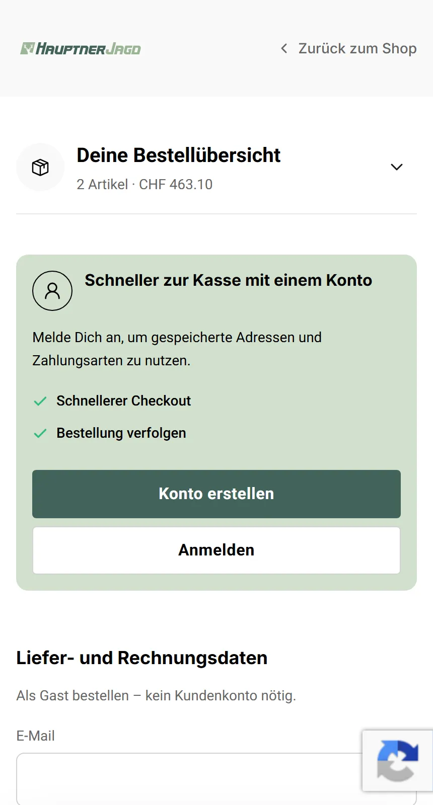
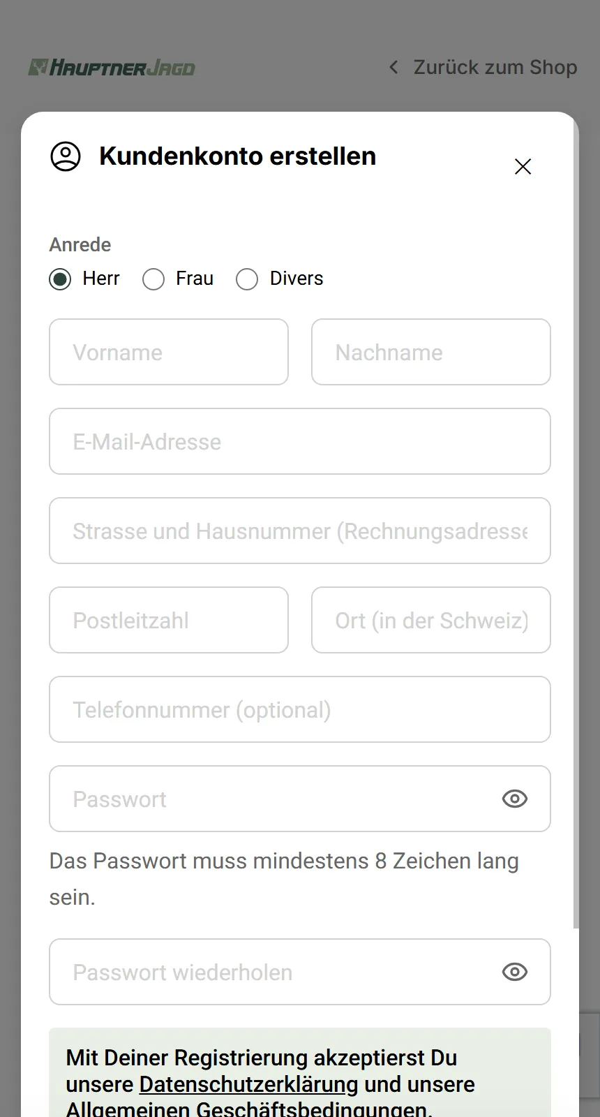
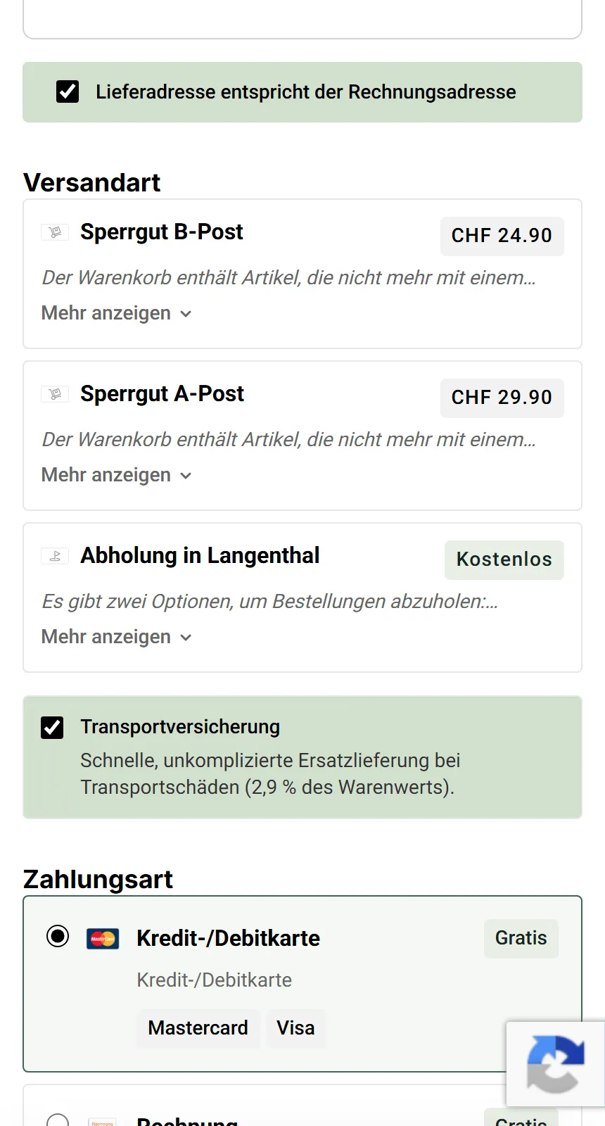
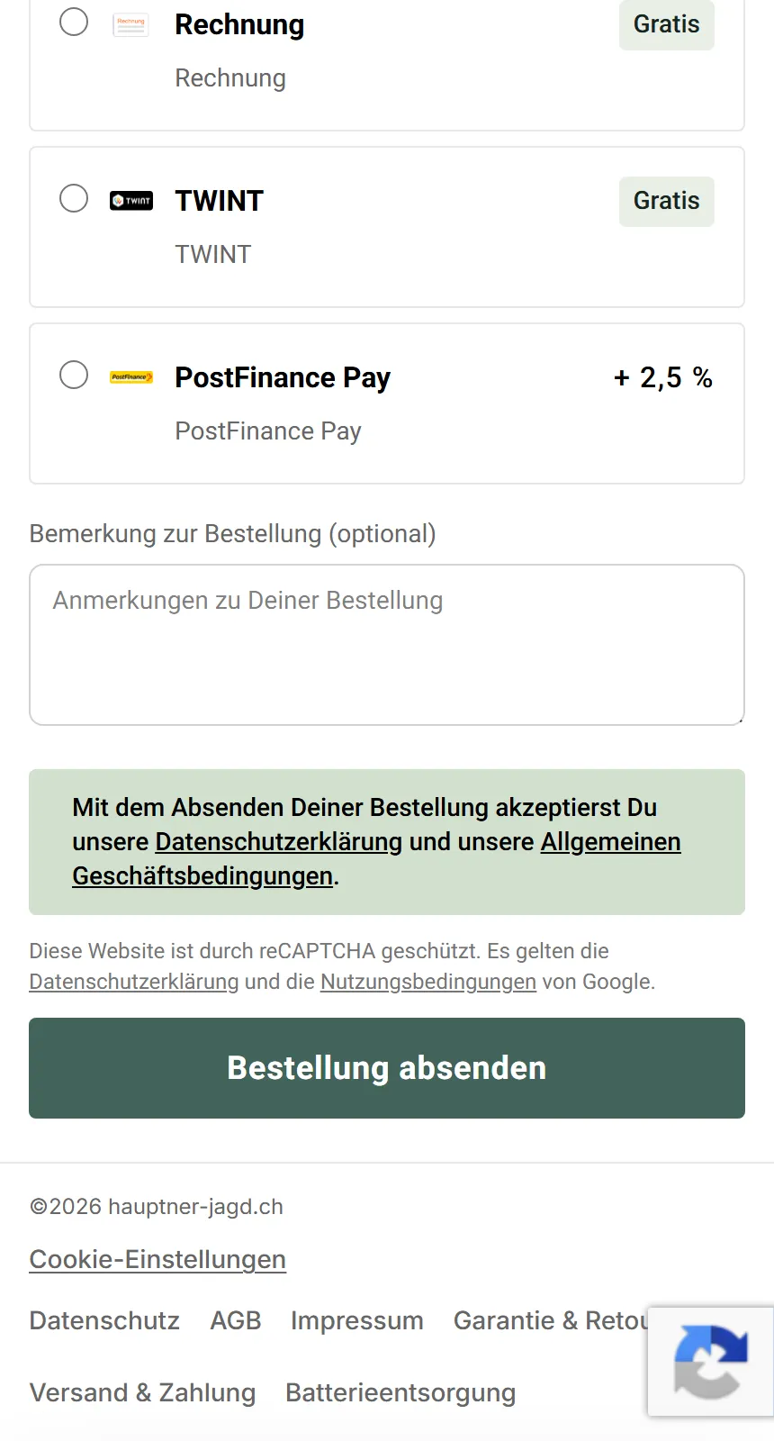
Following up the shopping cart with an equally minimalistic and intuitive checkout process is a crucial part of not breaking user momentum.
Product Detail Page
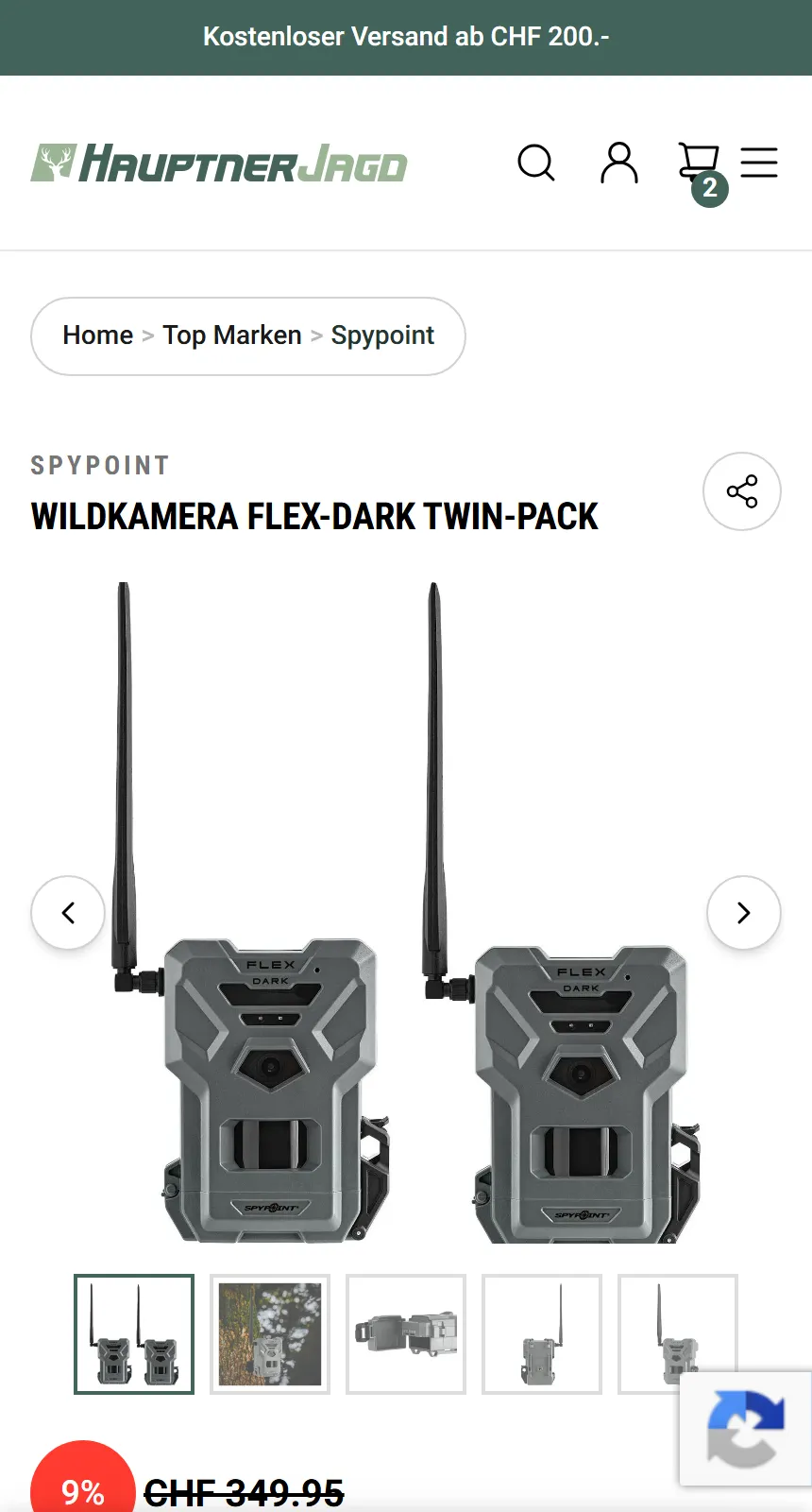
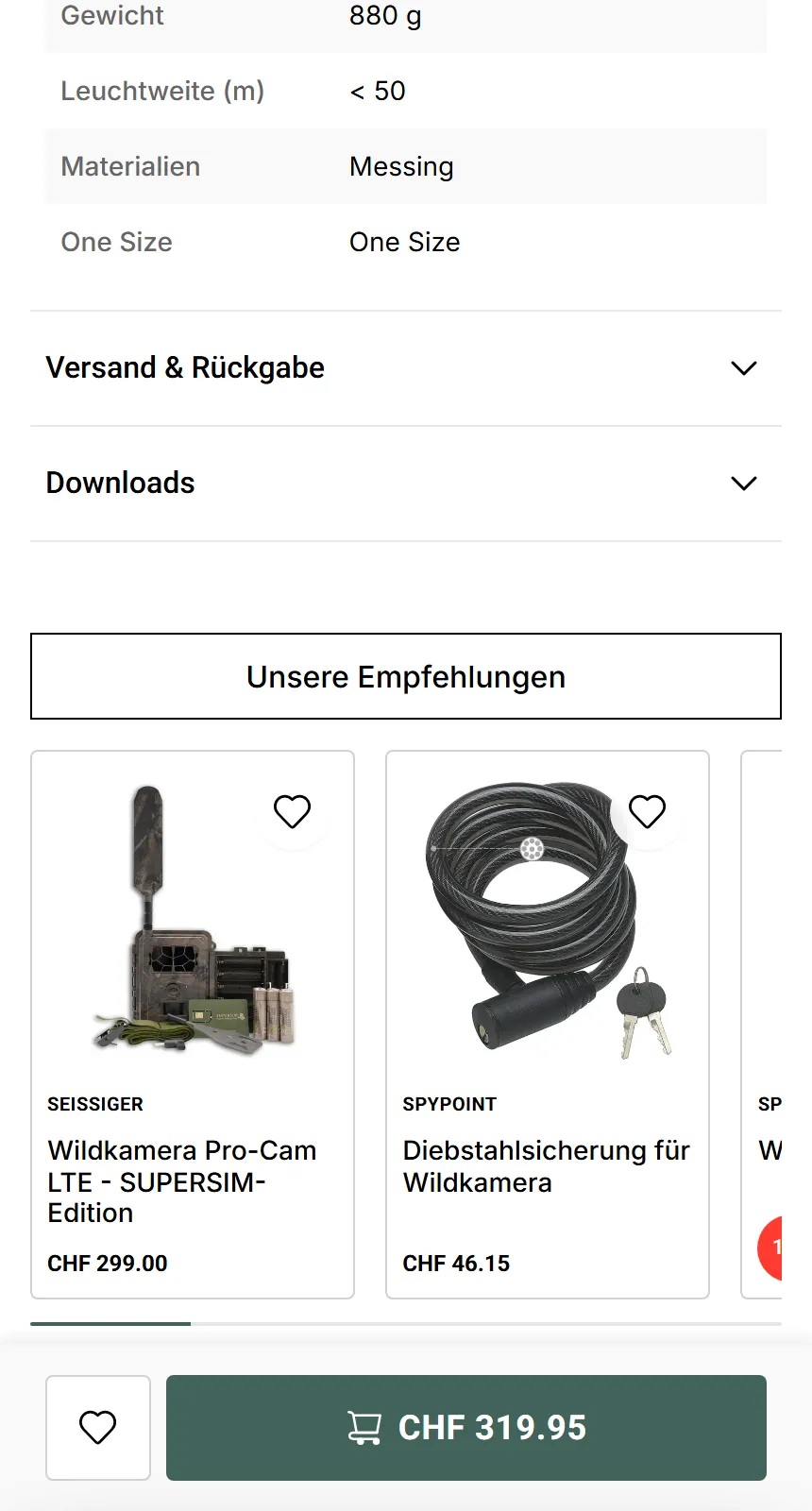
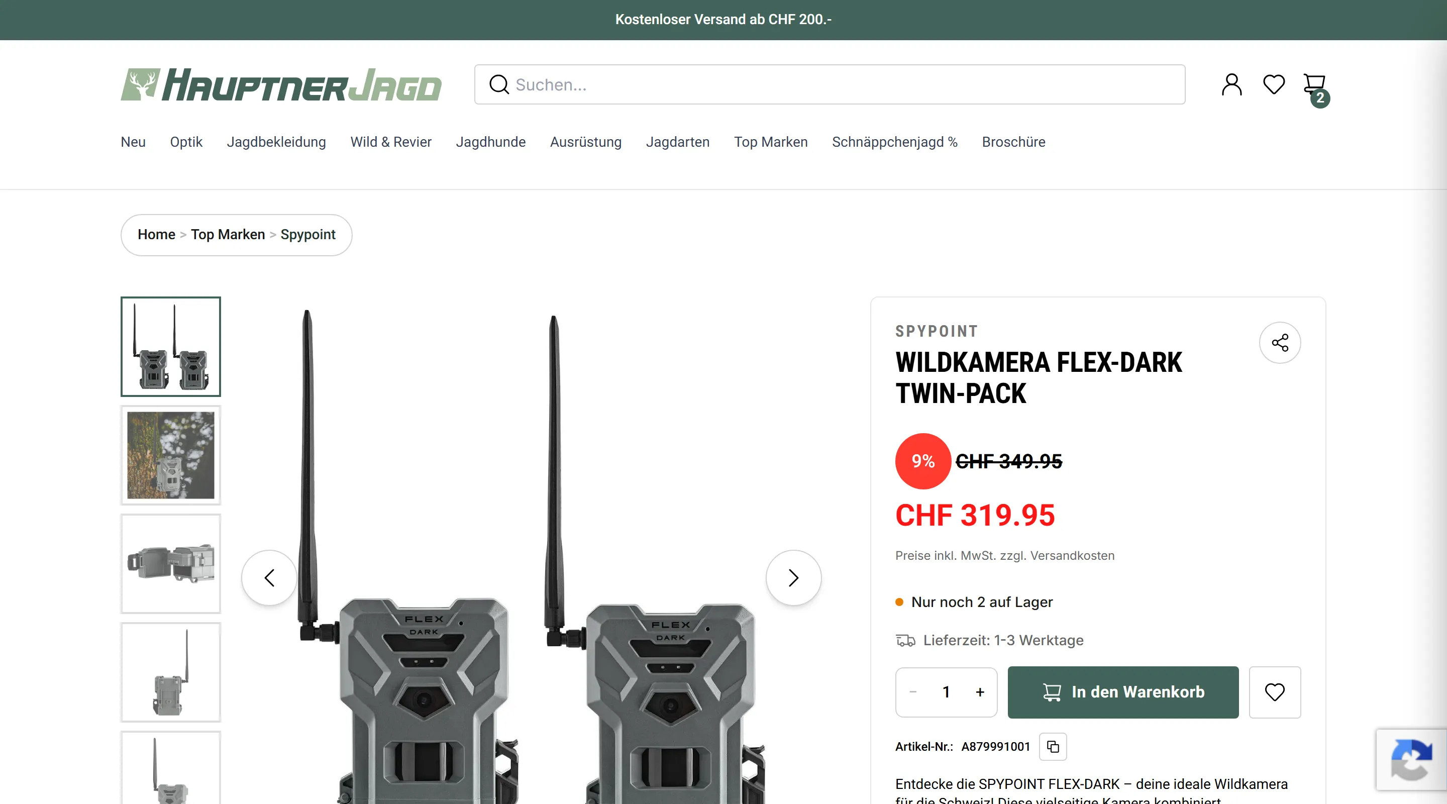
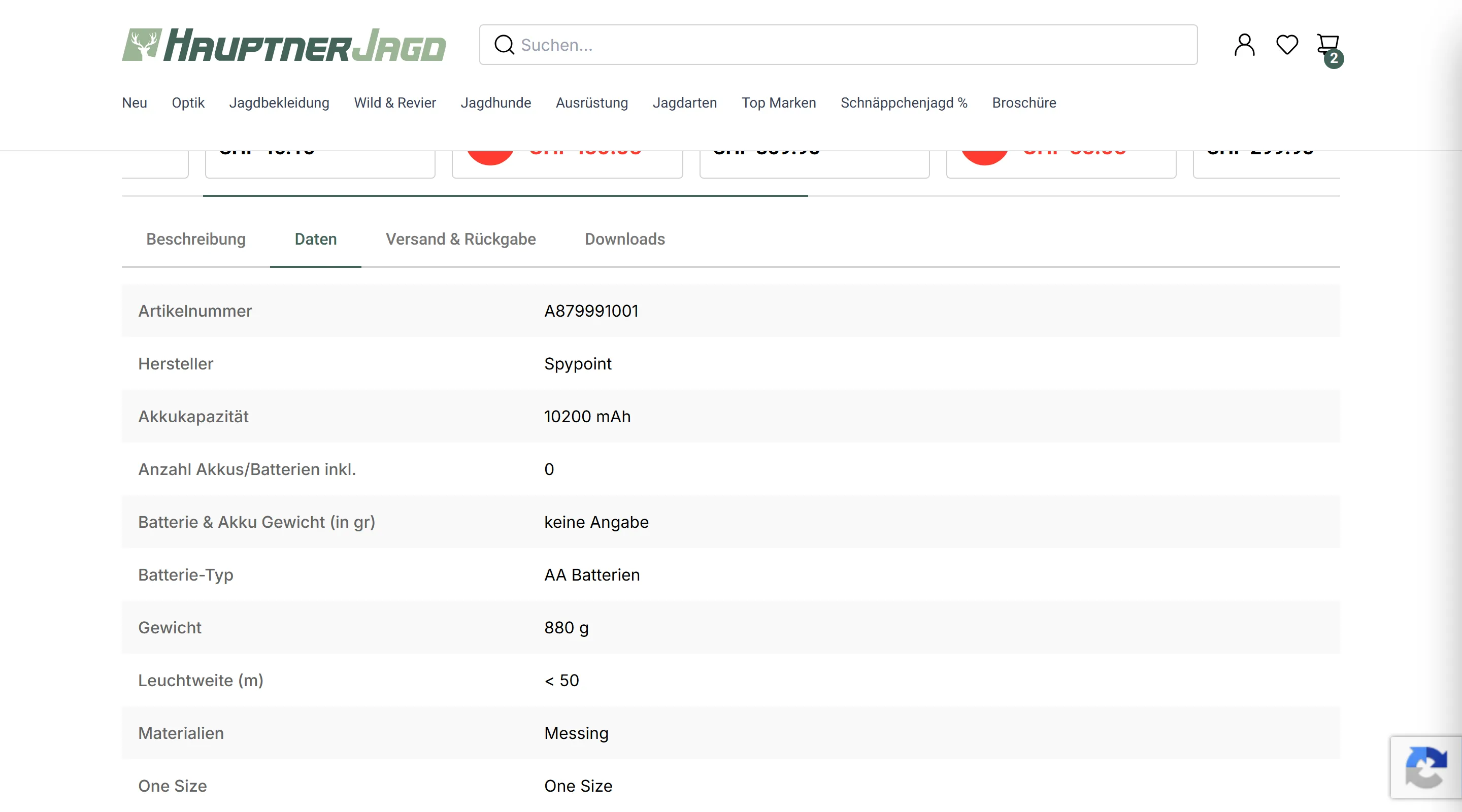
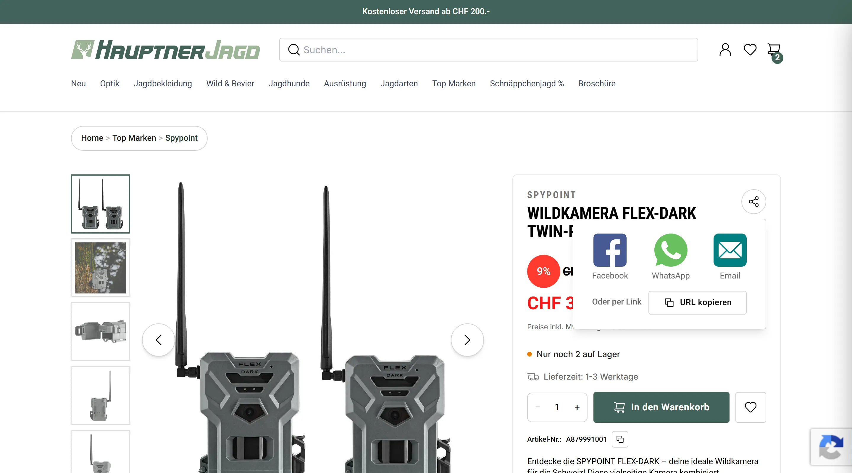
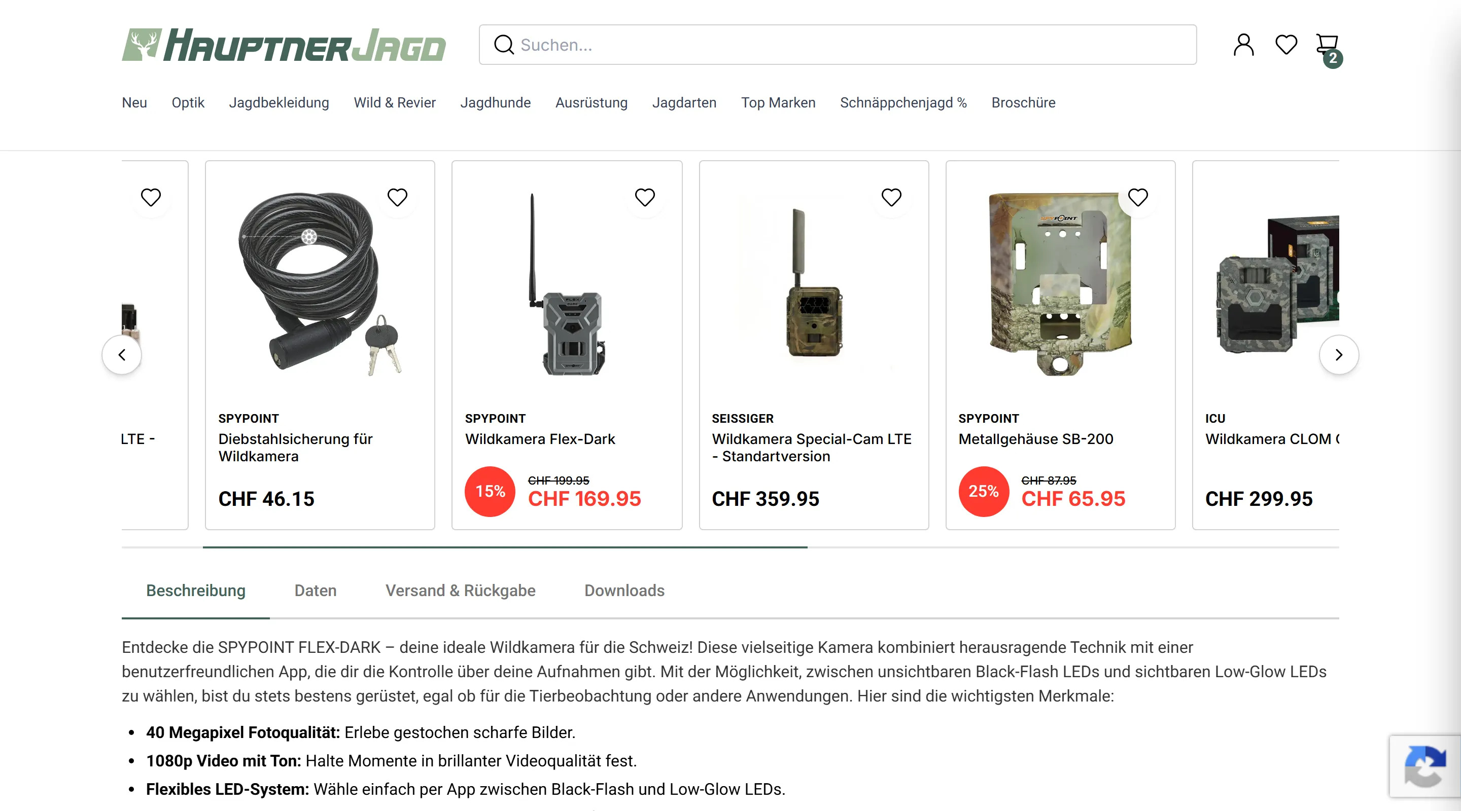
This page's impact cannot be overstated when it comes to UX optimization. This is especially the case in a shop where products differ drastically across metrics and variants.
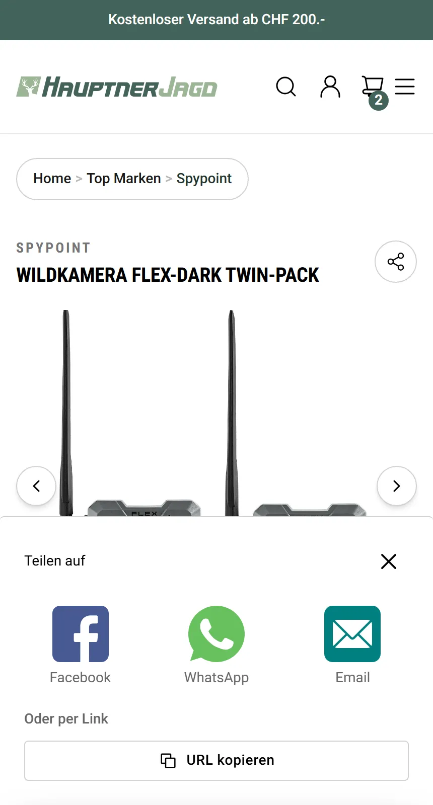
Easily accessible size charts, variants, digestible descriptions, user reviews, and legally compliant hazard information proved to be heavy hitters for increasing conversion rates. A share button is also particularly useful for qualities photos alone can't communicate.
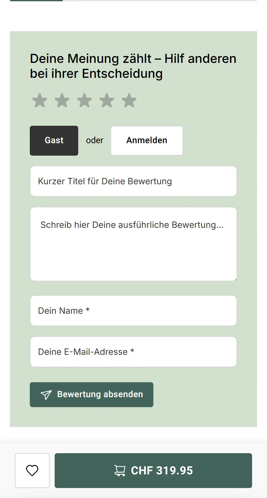
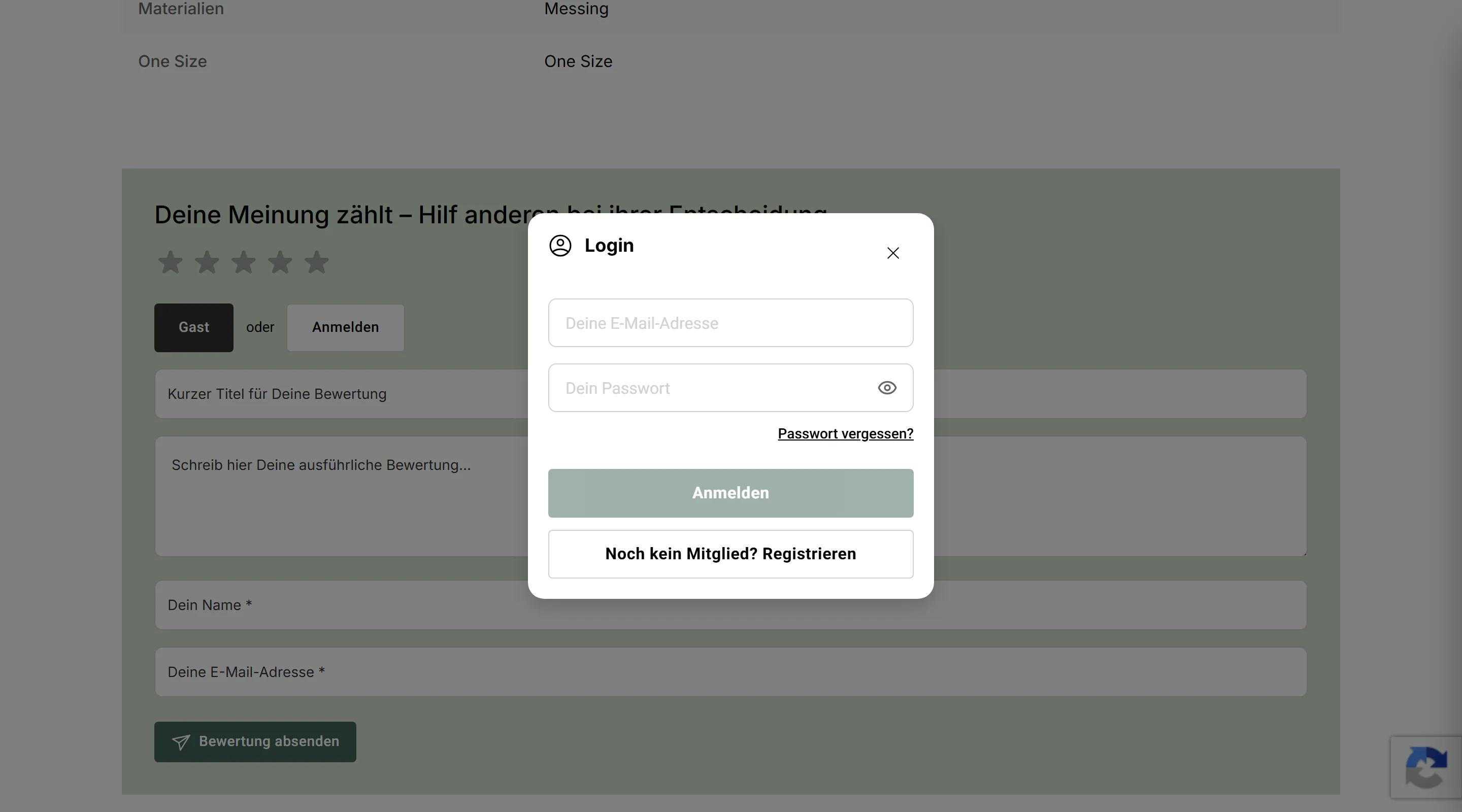
Review Flows
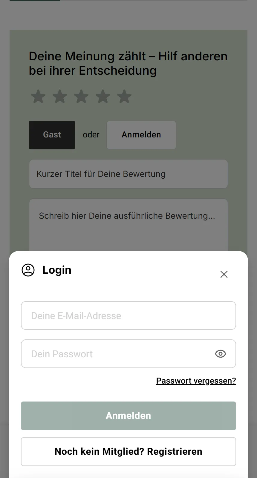
A challenge for user flows on this page was the product reviewing process. With guest reviews being a business need, the two flows start from different places and meet at the same result, all within the same page. This is another strong example of how mobile-first design positively impacts the experience on the platform.
PLP, Filters, and Discovery
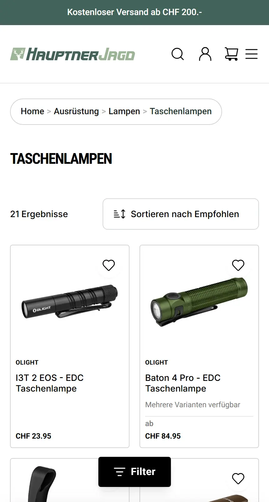
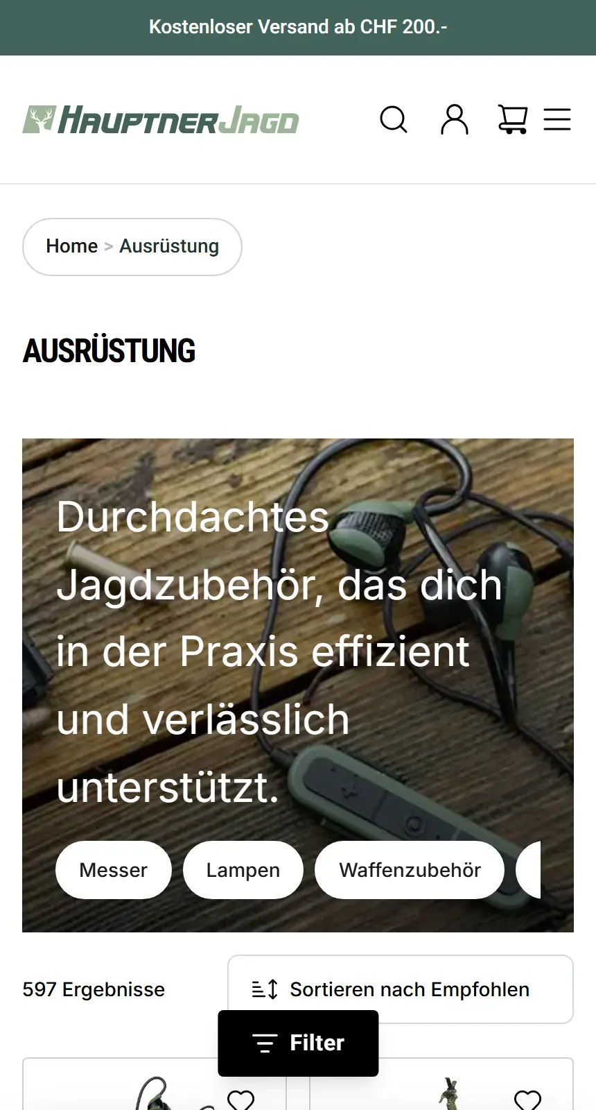
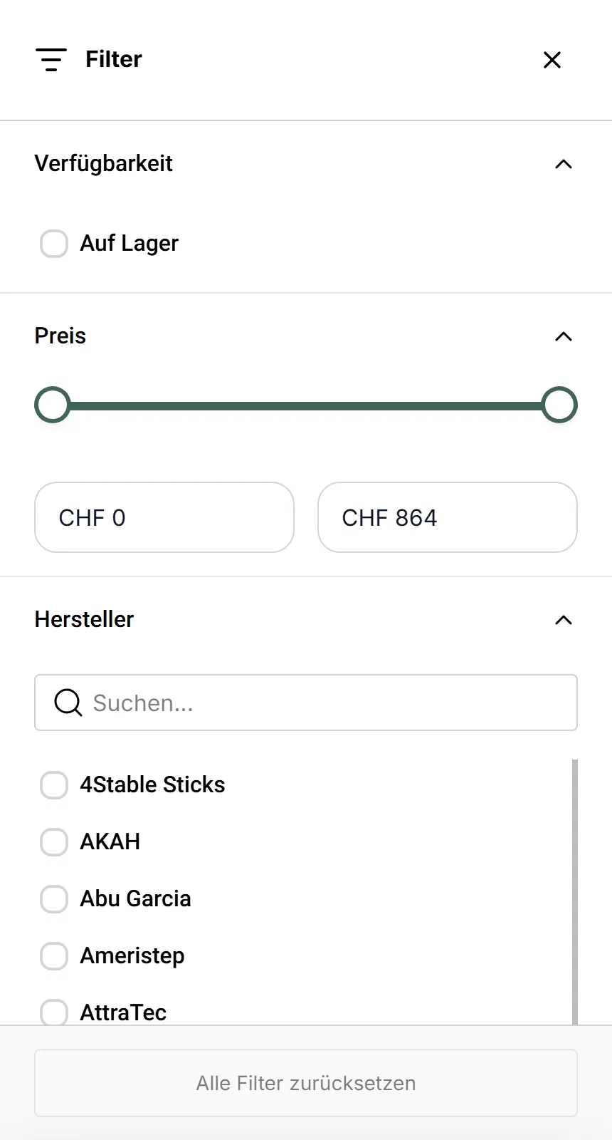
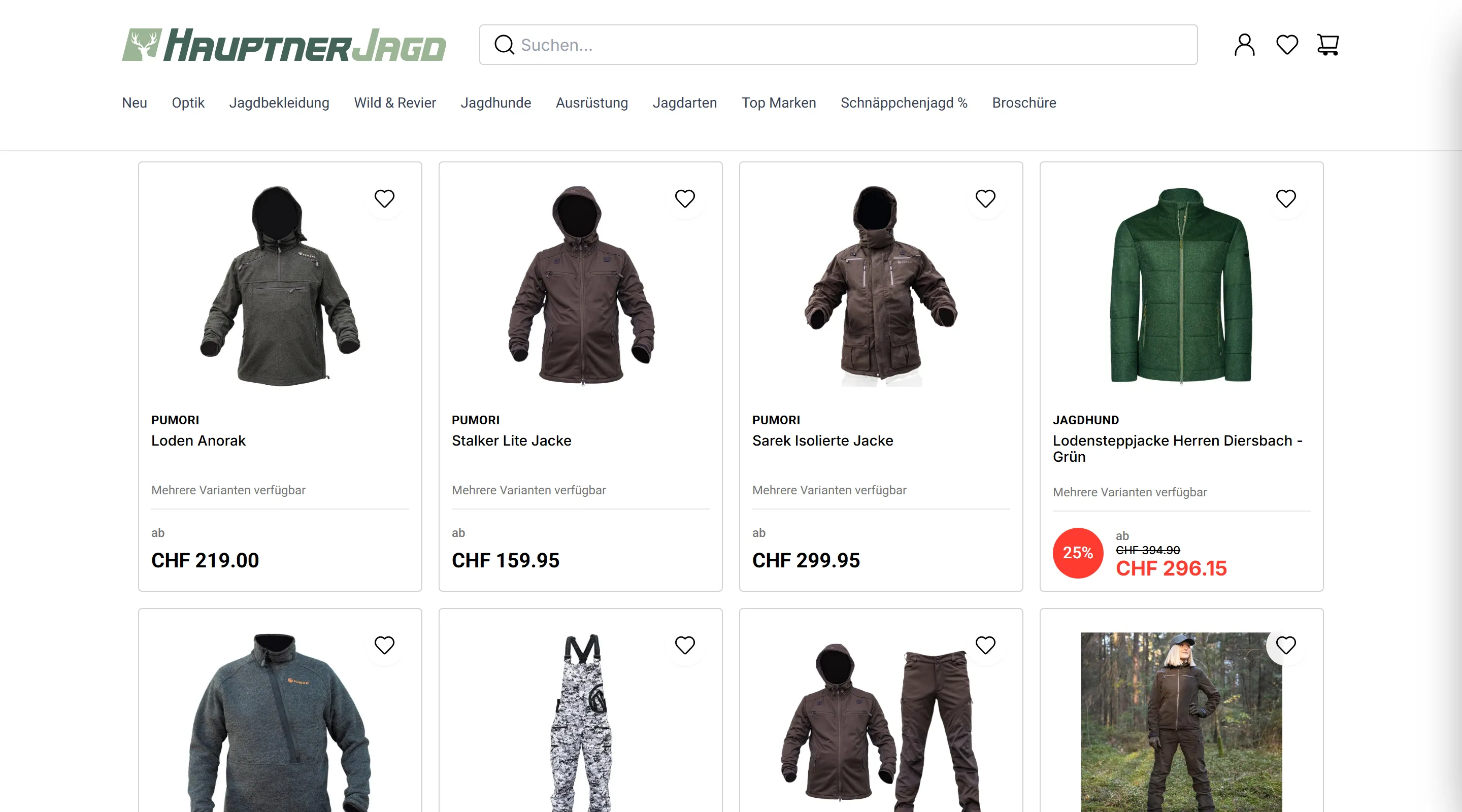
A successful product listing page balances exploration and finding the exact right item for high-consideration purchases. Both user retention and conversions depend on it.
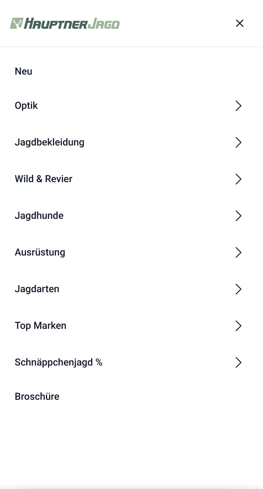
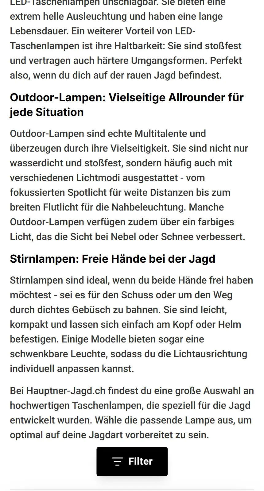
We designed a minimalistic and appealing UI that adapts to the different shops of the project, across a wide range of products, variants and price ranges. A main filter and category filter were designed, assisted by pill-shaped breadcrumbs for more precise mobile usability. SEO was not overlooked either, in thoughtful UX, discovery begins from an entry point.


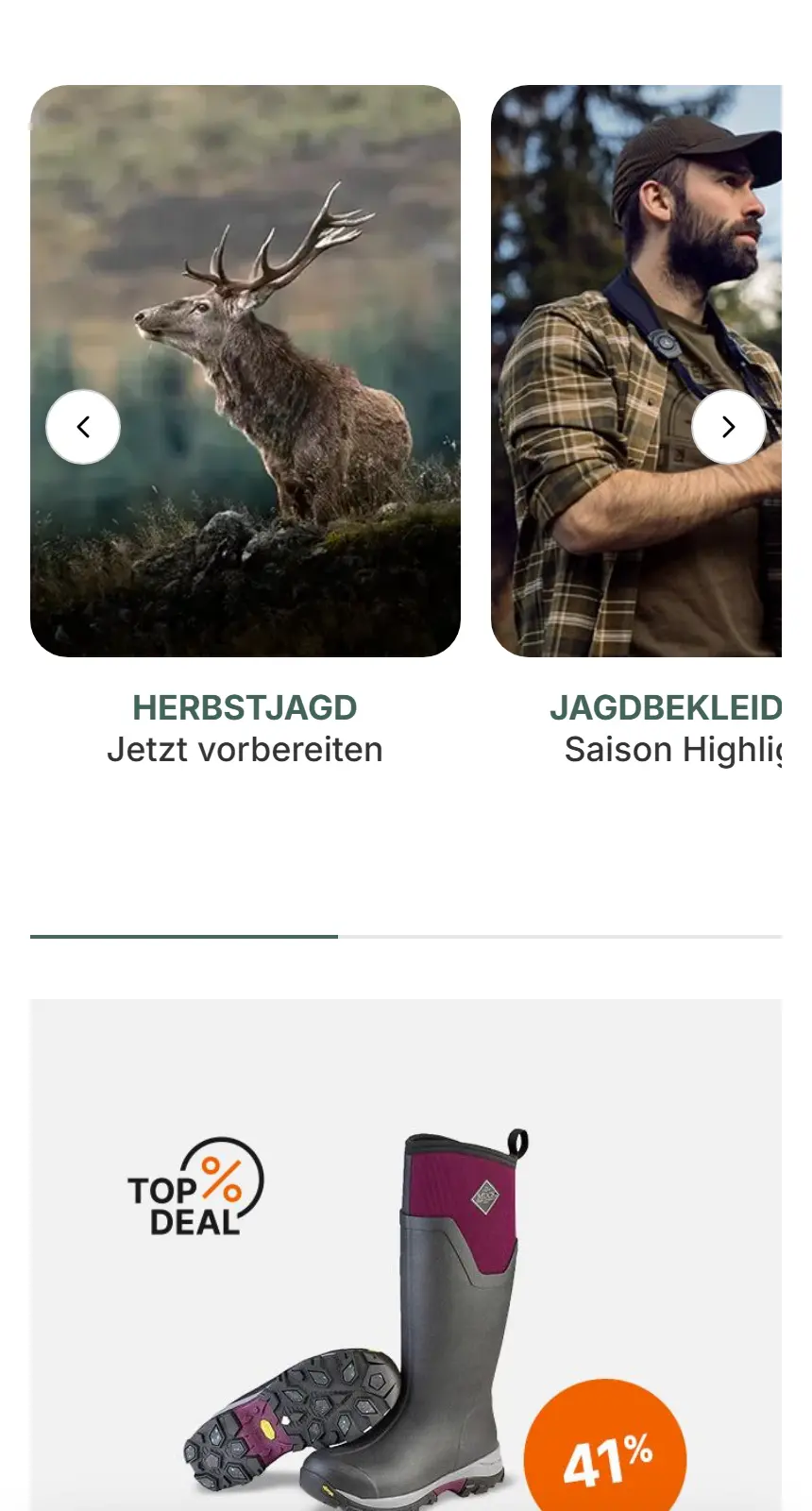
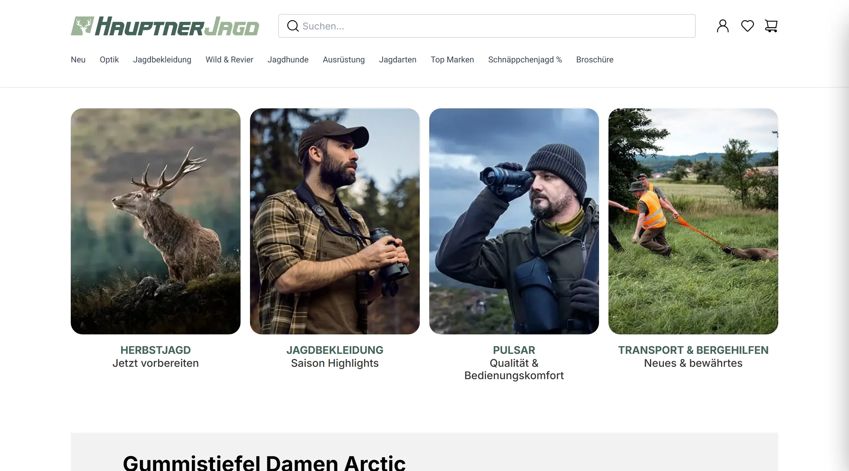
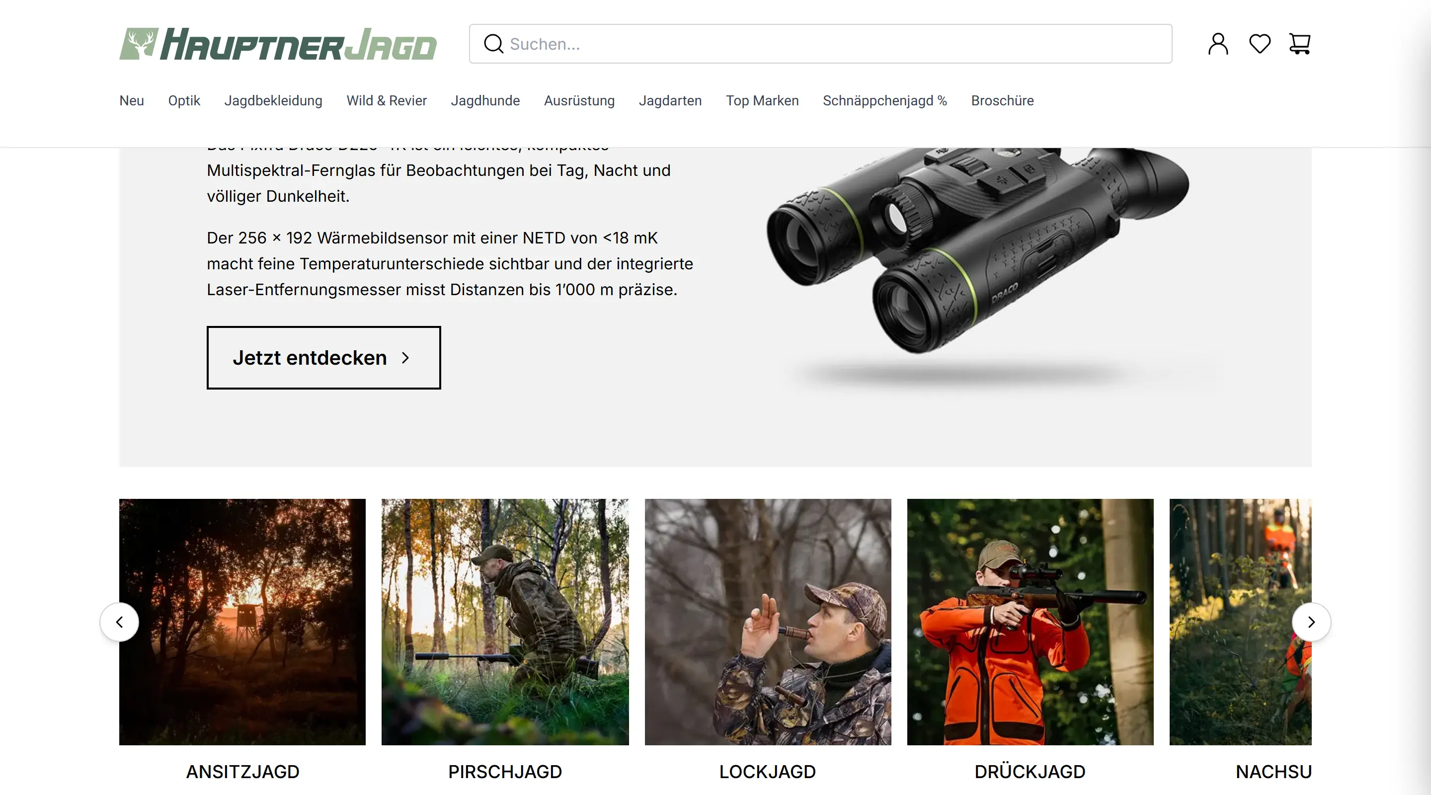
CMS: Grid & Logic
For this project's several brands, a content management system was implemented. With all the differences each brand has in identity, tone, mission and benefits, a grid system keeps consistency throughout, with a real effect on both team collaboration efficiency and UX.
User Account
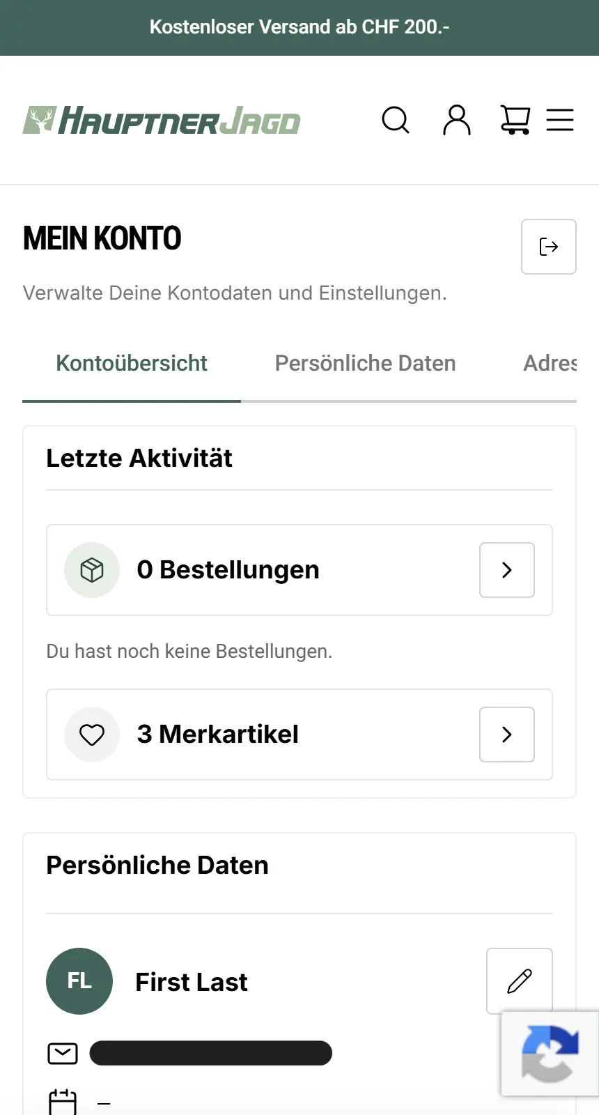
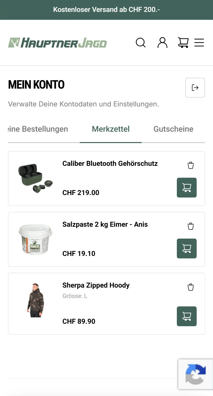
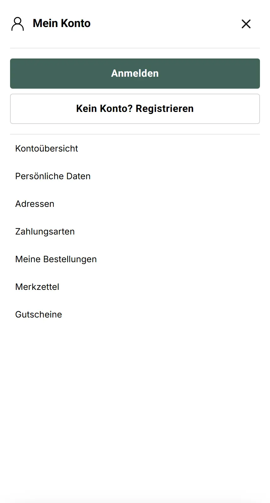
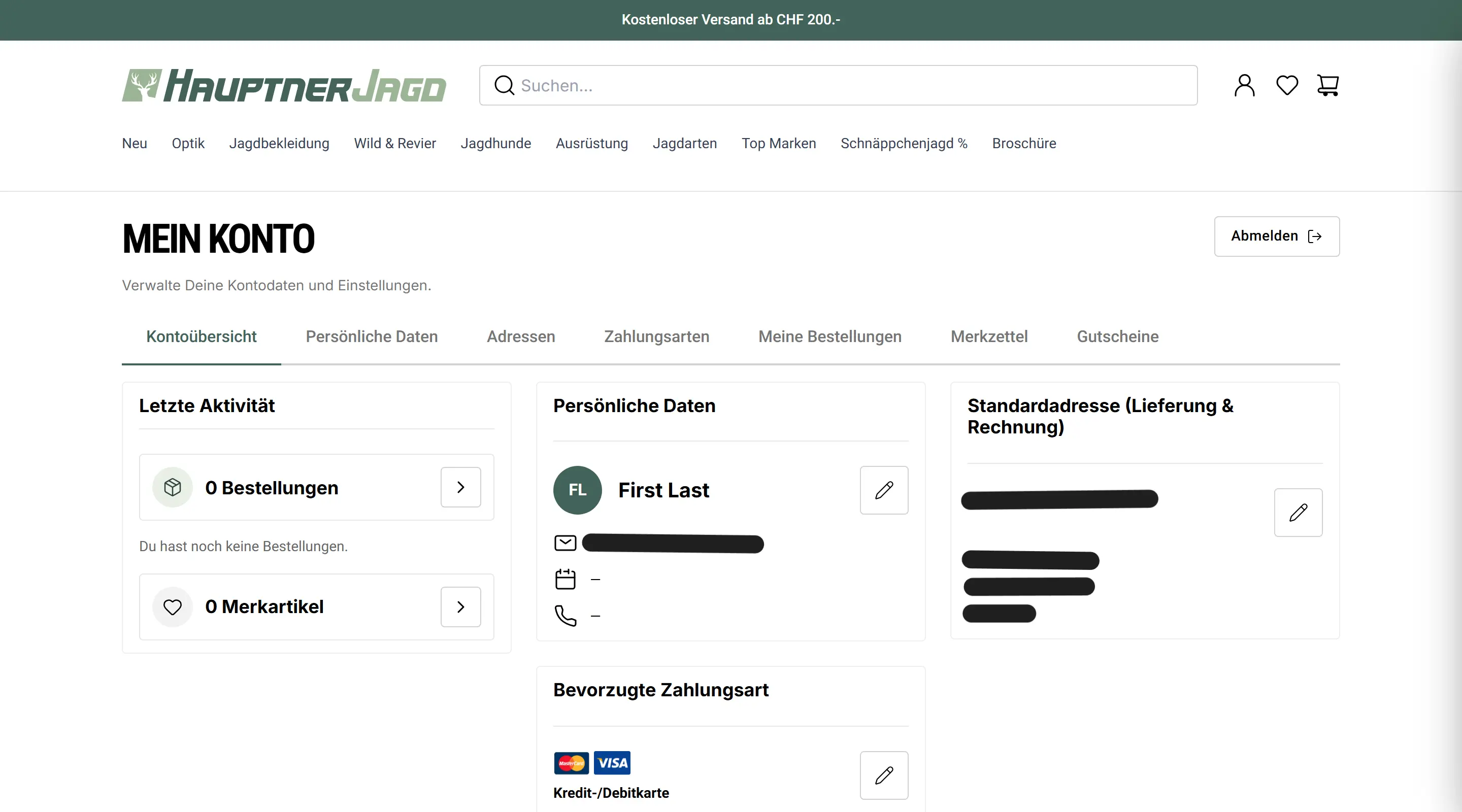
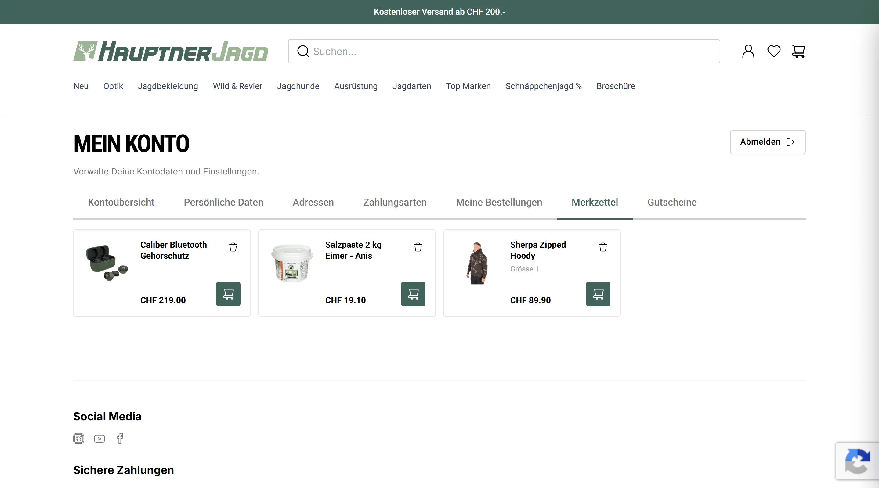
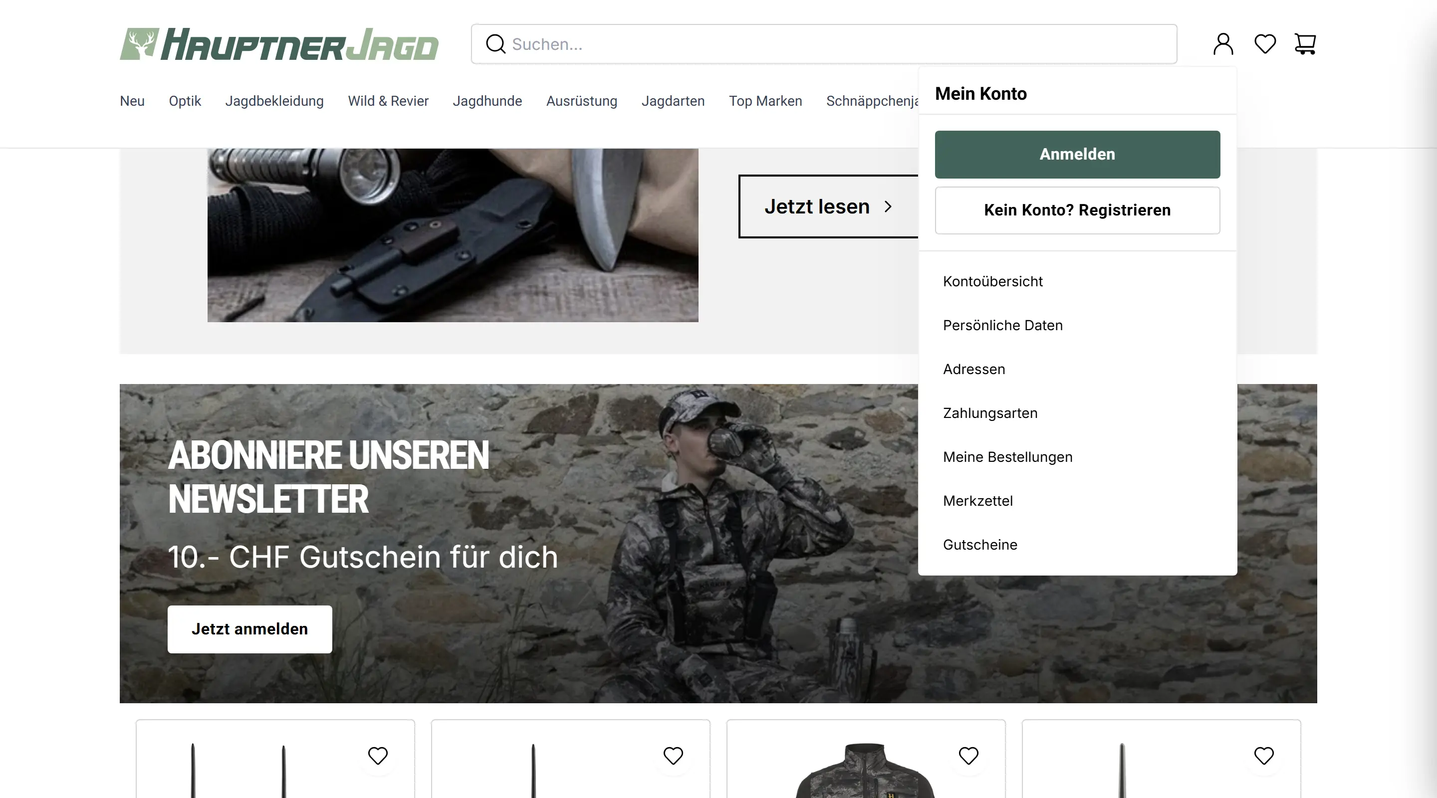
Post-purchase processes make a real difference to brand trust, loyalty and retention. A user-centric account page, where the invoice can be downloaded directly from the overview and orders list, is impactful when it takes user feedback into consideration, with a flexible layout that accommodates evolving needs and improves lifetime value.
Feedback
What my colleagues on the project say.
“Awsan understood brilliantly how to bridge the gap between our complex logistics logic and the actual needs of our users, consistently managing to balance ambitious UX goals with tight technical deadlines.”

“We consider Awsan a personality who consistently steered the design process independently and delivered measurable results. We can recommend him without reservation.”
“As our sole UX Designer, Awsan was instrumental in modernizing our platforms, successfully introducing a mobile-first philosophy that directly resulted in measurable growth.”